The Market Network
Full Brand Identity Creation for an East London Community Market Brand
The Market Network is a community market organizer connecting local food entrepreneurs with eager audiences at vibrant venues like Tower Hill Market and Wapping Docklands Market. Renamed from “Squid Ltd,” the brand needed a fresh identity that reflected its mission and avoided misleading associations.

OBJECTIVES
Rebrand from “Squid Ltd” to “The Market Network” to eliminate confusion with fish-market imagery
Develop a cohesive brand identity for use across digital platforms and print materials
Embed a sense of community, food culture, and local East London heritage
Primary Logo


Logo Suite
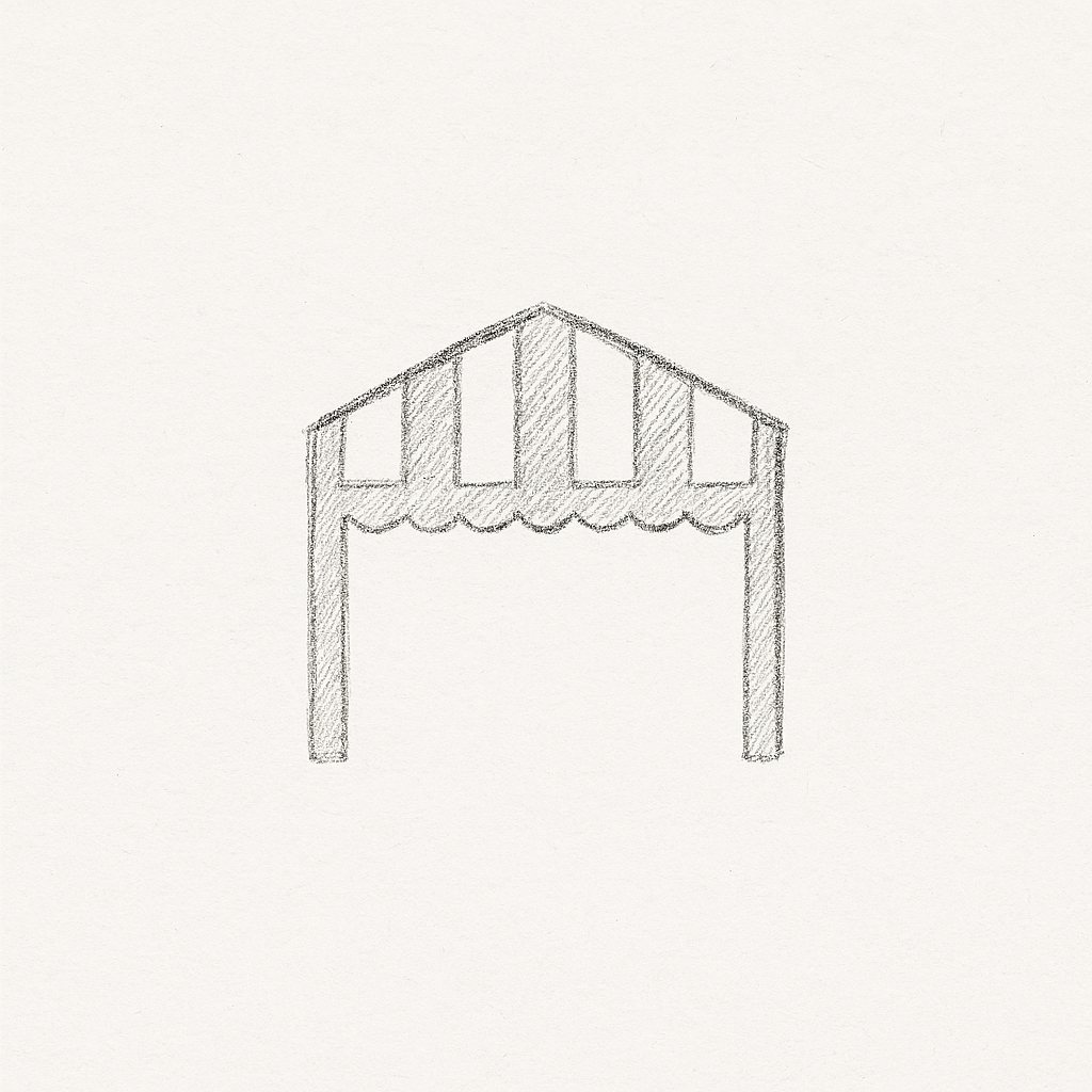
Designed a primary logo with a custom “market icon” replacing the “A” in “MARKET” to reinforce brand concept
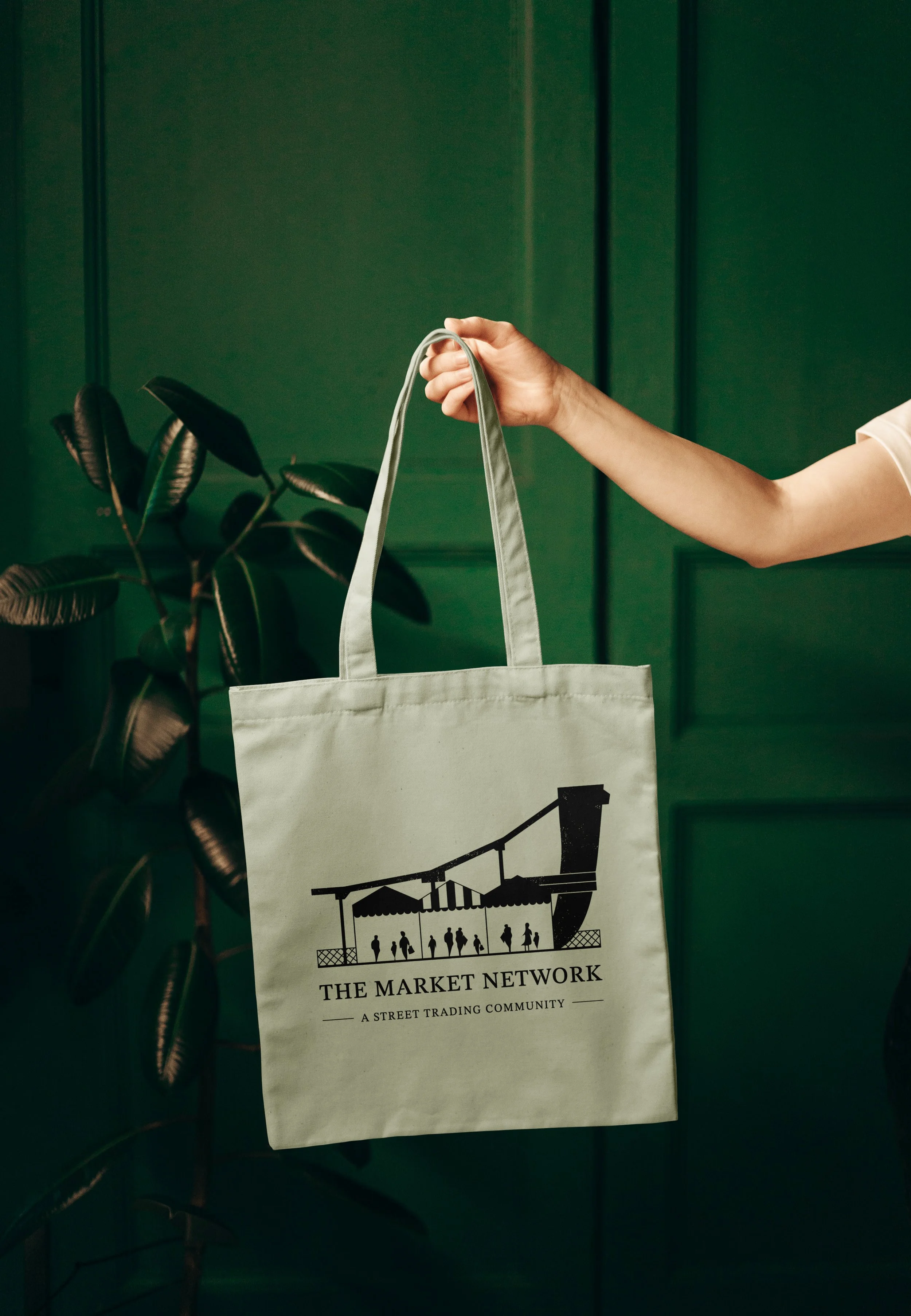
Crafted a secondary logo inspired by Shadwell Bridge a sentimental nod to the brand’s origins and a perfect print mark for bags, merchandise, and event banners
Developed a simplified submark for flexible usage across smaller or round formats

Secondary Logo
Inspired by Shadwell Bridge, East London
The secondary logo for The Market Network was thoughtfully designed to honour the business’s origins. Inspired by Shadwell Bridge a notable East London landmark the logo reflects the location of the very first market held when the business launched several years ago.
For founder William, Shadwell represents more than just a location; it marks the beginning of a community-focused vision. His strong emotional connection to the area made it important to incorporate a visual symbol that carried both personal meaning and local heritage. The result is a detailed, handcrafted logomark that pays tribute to the place where it all began.
